Fresh New Look!
It is done!
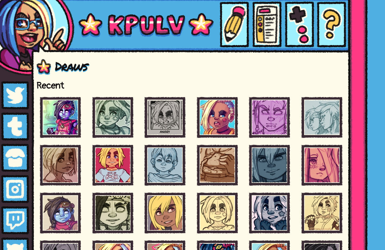
The fresh coat of paint is still drying so some things might be still broken, but overall I think this is looking pretty good.
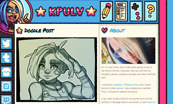
I really wanted to get a redesign of my site going because I honestly hated the artwork on the old one. If you draw you know what I mean. Your art doesn't age well usually. When you're constantly improving at your craft over time, you notice how horrible your older work is compared to your newer. I mean it may have not looked objectively horrible, but man it was so gosh dang old I couldn't stand it anymore.
I've been drawing a whole lot more lately so I thought my new website should reflect that and look all totally hand drawn. I tried to simplify a lot of things like the shapes and colors and textures of the site. My old site was flashy and a little complicated. I liked it, but I'm feeling like much more of a simpler look now without paint brush splatters and gradients everywhere.
Still to come is some more visual polish. You might notice that the site is now left aligned instead of centered (when it at maximum browser window size.) The right side that looks totally empty right now will eventually have some cool art in it. I just have to figure out what that art is going to be.
You might also notice that the website changes based on how large your browser window is! I hope to improve my site's performance on mobile, and also hope to keep the site pretty viewable on smaller screens while also taking full advantage of how high res everyone's desktops are now. The site's width has increased from 960 pixels to 1100 pixels or so, but that changes based on your browser's width.

I also went through and took a lot of my "doodle posts" and rolled them into my newly named "draws" page. Everything that was on there before is now filed under "ancient" and you definitely shouldn't look at it because old artwork is terrible and embarrassing.
That's all for now! More updates to come.
The fresh coat of paint is still drying so some things might be still broken, but overall I think this is looking pretty good.
I really wanted to get a redesign of my site going because I honestly hated the artwork on the old one. If you draw you know what I mean. Your art doesn't age well usually. When you're constantly improving at your craft over time, you notice how horrible your older work is compared to your newer. I mean it may have not looked objectively horrible, but man it was so gosh dang old I couldn't stand it anymore.
I've been drawing a whole lot more lately so I thought my new website should reflect that and look all totally hand drawn. I tried to simplify a lot of things like the shapes and colors and textures of the site. My old site was flashy and a little complicated. I liked it, but I'm feeling like much more of a simpler look now without paint brush splatters and gradients everywhere.
Still to come is some more visual polish. You might notice that the site is now left aligned instead of centered (when it at maximum browser window size.) The right side that looks totally empty right now will eventually have some cool art in it. I just have to figure out what that art is going to be.
You might also notice that the website changes based on how large your browser window is! I hope to improve my site's performance on mobile, and also hope to keep the site pretty viewable on smaller screens while also taking full advantage of how high res everyone's desktops are now. The site's width has increased from 960 pixels to 1100 pixels or so, but that changes based on your browser's width.

I also went through and took a lot of my "doodle posts" and rolled them into my newly named "draws" page. Everything that was on there before is now filed under "ancient" and you definitely shouldn't look at it because old artwork is terrible and embarrassing.

That's all for now! More updates to come.
No Comments


