I moved to a new URL! Check it out!

posts tagged with: art

Quick Digital Drawing Tutorial

Quick Digital Drawing Tutorial
Check out this quick digital art tutorial with this doodle yeah! This is a quick run through of my usual techniques that I try to squeeze the best looking image out of the shortest time possible with as little effort as possible because I just want to do a lot of drawings and not focus on one for too long.

Okay so first I'm using Clip Studio which is an amazing piece of software that sometimes you can totally grab for just $20 when it's on sale. I'm drawing on a Wacom Cintiq 22HD.

I always like to show what the final result is first:
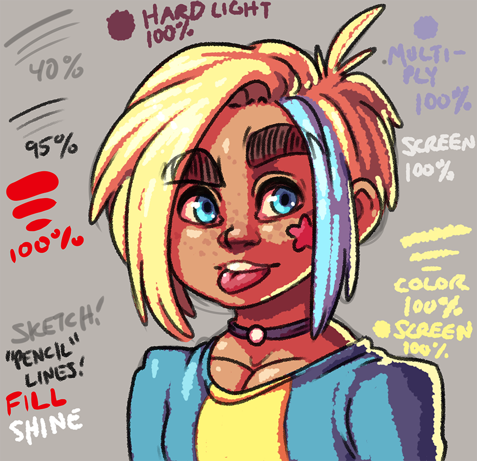
Image


Okay! I start with a 30 pixel brush at 100 opacity with a hardness of 60, and a brush density of 80. I make a rough sketch on a layer of 40% opacity. I also usually make the canvas some sort of dull color instead of pure white since I find it way easier to draw, and color on a darker canvas. Also I usually work at double the resolution I plan to export the image as, so all of these images as examples are actually scaled down 50%!
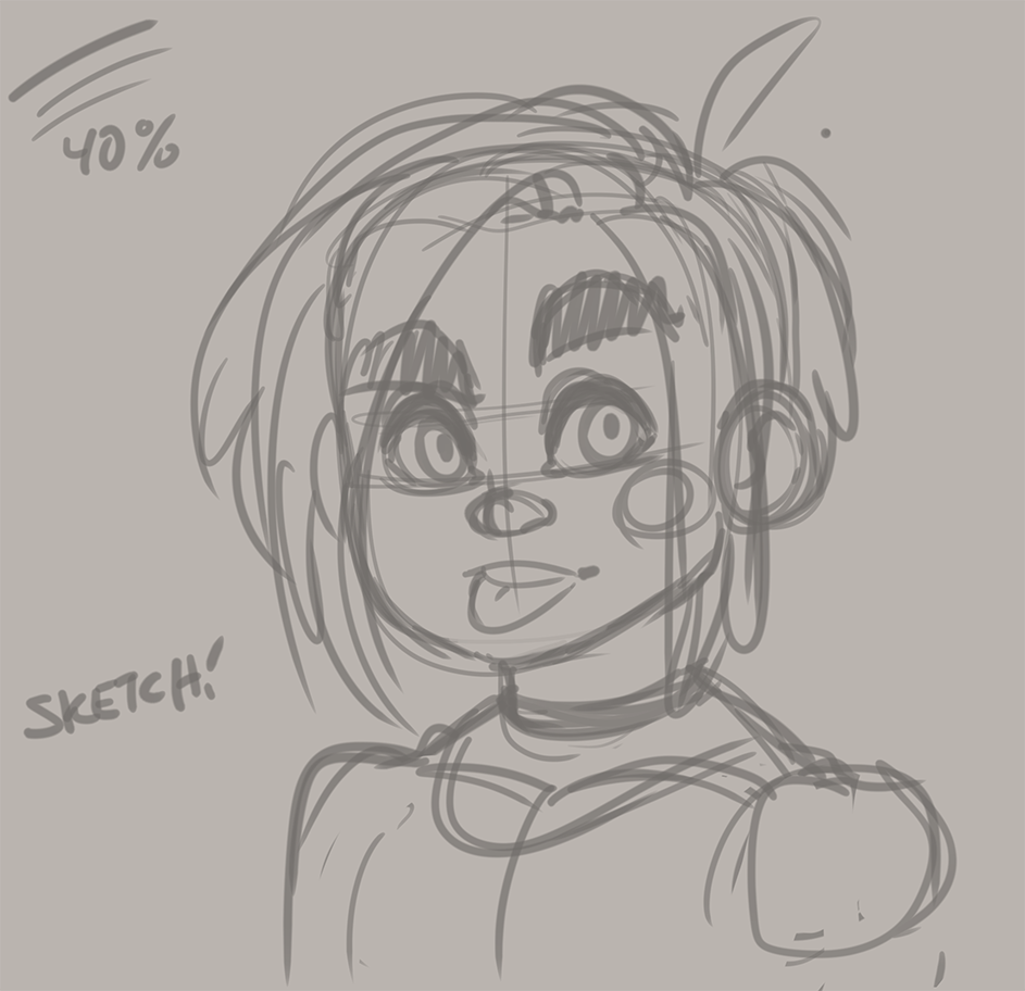
Image


On top of the sketch layer I drop a new layer for the line work. I use a brush that has particles to make it seem like a pencil on paper. With a brush size of 20, hardness 60, particle size 9, particle density 6, and spray deviation of 50 I draw over the sketch on a layer set to 95% opacity.

Quick CSS Animations

Quick CSS Animations
While I'm on a web development kick I thought it would be neato to point out some of the cool stuff I used for my new layout. I'm still working on game stuff that I am not allowed to share just yet so I gotta figure out other stuff to talk about on here!

Turns out in the modern era of browsers and css you can get animations with almost just pure css. When I redesigned the Super Meat Boy website I added some animations to a bunch of elements with just pure css. For more info on css animations check this out.

I wanted to get some animations going for hovering over image links on my new design, and some quick searching lead to animate.css. This handy stylesheet is full of animations that are super useful, but not exactly what I was totally looking for so I had to modify some things to come up with my own.

Dev Log: Upgrade Path Arts

Dev Log: Upgrade Path Arts
I'm home for the holidays so that gives me plenty of time to catch up on my missing blog posts for the month!

Here's something I updated in Sky Sisters a little while back:

Image


The assets for the "upgrade path" were a little lacking. Previously they were just some simple monocolored assets that had some minor effects. What I found though was that they were very hard to see against certain sky palettes. I tried some tricks like shifting the color of the asset around to make them stand out more, but I was having a hard time making them out. If I was having a hard time that meant that any players would have an even harder time, so out they went.

I opted for a more detailed asset that is trying to be more in line with how the upgrade diamonds look themselves. There are some minor issues with these but I don't see them changing much beyond this iteration.

Dev Log: Particle Polish

Dev Log: Particle Polish
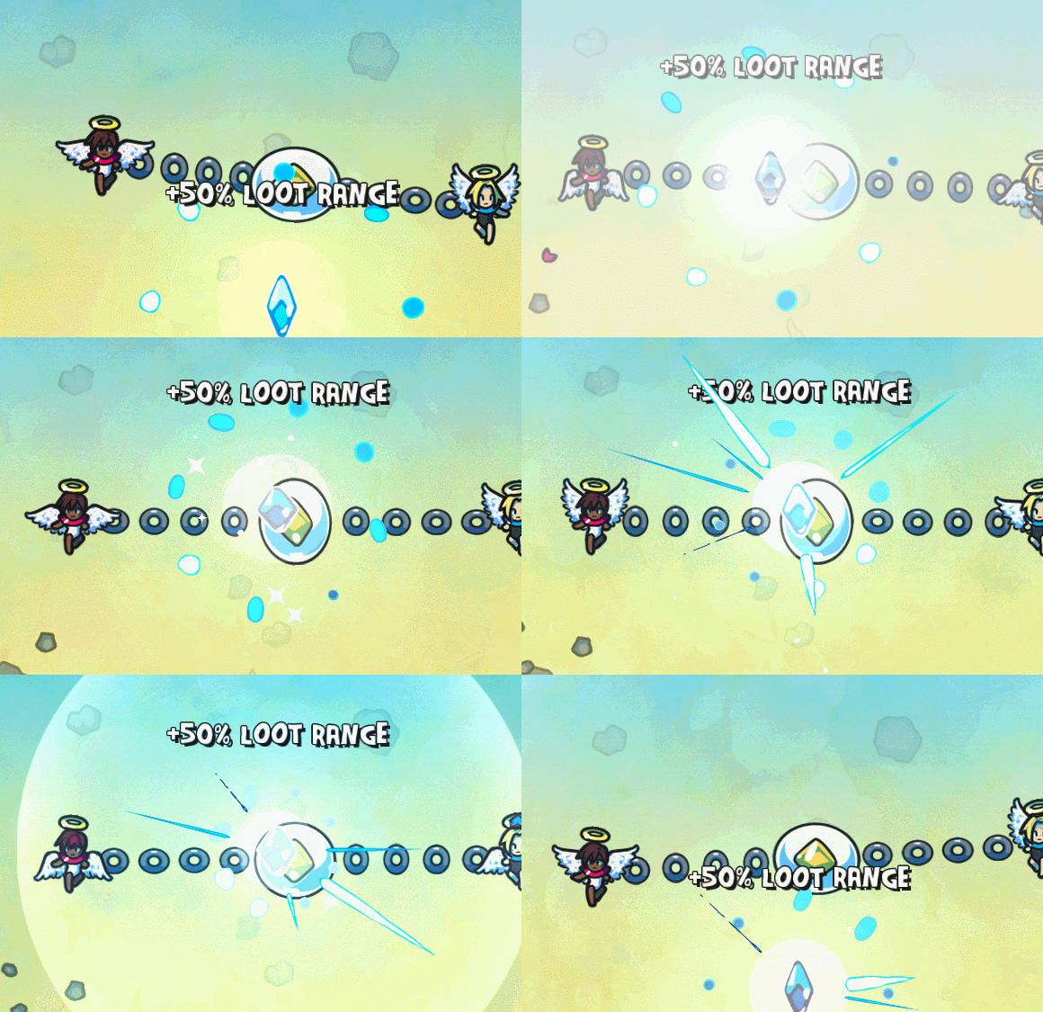
I've just been hopping around on Sky Sisters revisiting some areas that needed a little bit more love. I wanted to make the upgrade diamonds a little bit more clear when the players touch one.

Image


The changes are super subtle but hopefully they get the message across a little bit more. I adjusted the screen flash and the particle burst when the orb touches the diamond, and I also added a flashing effect onto the diamond itself that gets more intense. I also shortened the overall time it takes for the whole effect to play out.

Gameboy Doodle

Gameboy Doodle
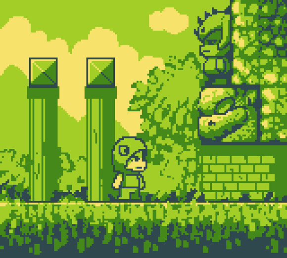
I've been messing around with Otter FNA and at some point I'm going to need a test project to throw together. I thought it would be fun to make something in the Gameboy style. Maybe something that looks like this!

Image


Oh right... I should be finishing Super Sky Sisters...

Travel Pillow Mock Up

Travel Pillow Mock Up
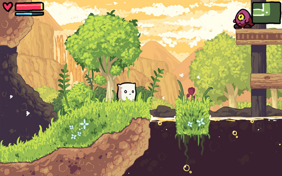
One of the main reasons I need to finish Sky Sisters is so I can get started on this dang game.

Image


The full version is on my twitter. This is the main reason I'm still looking for an editor that easily supports tiles with bleed over on the edges. If this mock up were using strict tiles I would end up with a billion different tiles and a billion tile layers to make it all work.

Anyway just dreaming of what I want to do next. Probably with FNA!