I moved to a new URL! Check it out!

posts tagged with: design

Border Image Magic

Border Image Magic
Here's another hot web tip! Did you know about border-image?! It's what I've been searching for in my web design projects since I was 14 years old.

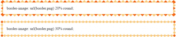
So lets talk about the world of designing image intense websites before I discovered the magic of border-image. In order to have a div element have some sort of image border I had to take an image and slice it up a bunch of different ways depending on how dynamic the div was going to be. If it was a div that would only ever stretch vertically then I could get away with 3 images: one for the top, another for the bottom, and the last for the repeating vertical portion. If the div was going to be stretched both vertically and horizontally then the number of images increases to a whopping 9! Each corner, each side, and the center. Sometimes this is known as a nine slice in certain user interface contexts.

Image


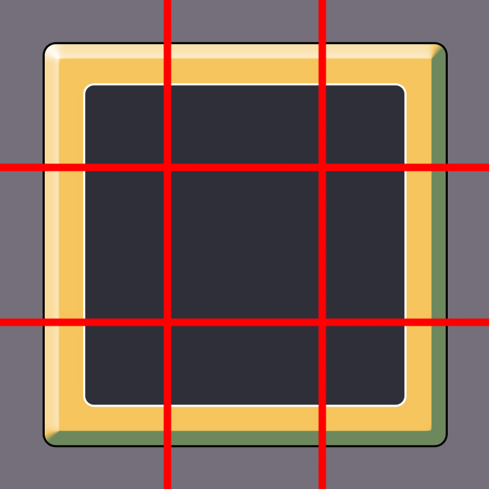
Way back in the day when it was only possible to have one background element inside of a div I had to do things like have multiple layers of divs in order to display each background image. Three slices of an image meant three divs to display it properly. Nine slices meant nine divs! As you can imagine this makes the html look bloated and messy.

Google Font Stuff

Google Font Stuff
I knew when making this blog design I wanted to go with some kind of hand drawn sort of look, so I wanted to have a look for fonts that would match. Way back in the day getting a font to render that wasn't on the end user's computer was a gigantic pain if not nearly impossible.

Up until pretty recently the main solution I went to for custom fonts were some pretty complex solutions involving making a canvas and rendering the font to it like an image but somehow also using some weird magic to make the text selectable as if it were normal text... but those days are gone! Now modern browsers with css can load almost any font imaginable.

For this site design I was luckily able to find a couple of things that I liked on Google Fonts, which has grown in size enormously since I last checked in on it. There's now an entire section for hand written looking stuff, and since Google hosts all of the data for using a font it's an incredibly simple addition to your html and css files to get it up and running.

Image


Beyond that if what you're looking for isn't available on Google then you can turn to the services of Font Squirrel. Font Squirrel does not offer hosting of the font data files like Google does, but it does have a huge selection of fonts already ready to rock. On top of that Font Squirrel allows you to upload fonts to convert into web friendly versions. The only gotcha with this however is that you need to be sure your font is licensed in a way that allows you to do this. The big advantage with the fonts already available on Font Squirrel and Google is that they've already been cleared in this way.

Image


Getting custom fonts up and running in web browsers is easier than ever, but this is a great power that requires great responsibility... or whatever, who cares, go all out. Just think of how many options we have beyond Comic Sans now!

Super Fast Lightbox

Super Fast Lightbox
One of the things I always make sure to include on any of my site designs is a cool way to view larger versions of images, and that usually involves using some sort of "lightbox." Nobody wants to click on an image and have it totally replace the page that they were browsing, or have it open in a new tab, right? Or maybe that's just me.

A lightbox is a cool way to have a full image display on a page without navigating to a new page, and without popping open a new window or a new tab in the process. Many many years ago light boxes were giant monstrosities of javascript and css that seemed to barely ever work when I tried to use them on my sites, but these days thanks to advancements in both js and css they've become a lot more simple to implement.

For my new blog design I went with a super simple lightweight bare bones light box called Lity. Lity boils down to a single css file, and a single javascript file, and was incredibly easy to toss into my design. There aren't any themes, or images, or crazy styles to worry about like so many of the other lightbox solutions I've tried in the past. Once the files are properly included in the html, all you have to do is add a data-lity attribute to a link element (the "a" tag) and Lity takes care of the rest.

Image


I guess that's all there is to this post! Lity is a simple and fast solution to lightboxes, and seems to work well on mobile too which is pretty dang important these days. If you have any other suggestions on lightbox stuff let me know

Fresh New Look!

Fresh New Look!
It is done!

The fresh coat of paint is still drying so some things might be still broken, but overall I think this is looking pretty good.

I really wanted to get a redesign of my site going because I honestly hated the artwork on the old one. If you draw you know what I mean. Your art doesn't age well usually. When you're constantly improving at your craft over time, you notice how horrible your older work is compared to your newer. I mean it may have not looked objectively horrible, but man it was so gosh dang old I couldn't stand it anymore.

I've been drawing a whole lot more lately so I thought my new website should reflect that and look all totally hand drawn. I tried to simplify a lot of things like the shapes and colors and textures of the site. My old site was flashy and a little complicated. I liked it, but I'm feeling like much more of a simpler look now without paint brush splatters and gradients everywhere.

Still to come is some more visual polish. You might notice that the site is now left aligned instead of centered (when it at maximum browser window size.) The right side that looks totally empty right now will eventually have some cool art in it. I just have to figure out what that art is going to be.

You might also notice that the website changes based on how large your browser window is! I hope to improve my site's performance on mobile, and also hope to keep the site pretty viewable on smaller screens while also taking full advantage of how high res everyone's desktops are now. The site's width has increased from 960 pixels to 1100 pixels or so, but that changes based on your browser's width.

Image


I also went through and took a lot of my "doodle posts" and rolled them into my newly named "draws" page. Everything that was on there before is now filed under "ancient" and you definitely shouldn't look at it because old artwork is terrible and embarrassing.

Image


That's all for now! More updates to come.

New Webzone Coming Soon!

New Webzone Coming Soon!
Say goodbye to this old and busted layout for my blog.

It's probably not that busted, but it is coming up to maybe 5 years old according to my first post here ever. I've spent the last couple of days cooking up something new! I'm still going to be using the same back end, so all of the posts and everything will be preserved exactly as they are, but the front end will look totally fresh.

Image


I think one of the reasons my anxiety flies so high is when I leave things the same for too long, and my website is one of those. For some reason I've just spent a lot of time being too intimidated to gut my site and start fresh. There's something about digging into an old project... it can be scary!

Anyhoo, enough talking about it. Probably at some point tomorrow I'll be migrating all of the front end to the new hotness.

Sky Sisters Upgrades

Sky Sisters Upgrades
I think the last actual question to ponder in the world of Super Sky Sisters is the upgrade system. A long time ago when I demoed the game at an event in Denver I got some feedback that suggested that it would be more interesting or fun if the players had some sort of active goal to pursue. This came mostly in the form of maybe collecting something actively, or something along those lines. Basically the way that the game is played right now is that you are always just reacting to things and never just acting.

The strongest idea that came out of thinking on this for awhile was tying the upgrades to some sort of active goal that the players could pursue. I decided to go down the path of collecting things and put a small challenge in that involves the players guiding the orb along a predetermined path. When they completed a lap on the path they would earn an upgrade, and the path would then demand more of them for the next upgrade by either changing shape or adding more laps, and so on. At first this seemed like a good idea but lately I'm totally not sure.

Image


The upgrades are things like +20% damage, or +10% special recharge, or +50% loot range. I think the upgrades are actually a lot of fun and when I added them to the game it seemed to really fit and complete some sort of puzzle that I was staring at for months. It almost seems like a hack since it seems like players in general are always going to respond well with some sort of +X% of something opportunity in a game, but it also gives the sense of progress and that is actually quite difficult in Sky Sisters since the entire game takes place in a single square arena.

So right now I'm at a crossroads. I like how the upgrades require the players to do something actively to earn them, but the more I look at it the more complex it seems. Adding this new idea of an upgrade path on top of everything else just seems like a giant mess, and the game is already messy and chaotic most of the time (especially at the higher difficulties.)

Image


The more I think about it the more I want to remove this system entirely and make upgrades a thing you just earn halfway before a boss, and immediately after a boss. This is the super tough part of designing a game like this. It's not as obvious to me as say changing the layout of a level to teach a mechanic easier. It's a big system with a lot of moving parts and messing with one part changes all the others. When I watch people play the game it seems like they're already trying their hardest to just survive and go for a high score, so maybe I'm reading into this feedback a little bit in the wrong direction.

Back when I received this feedback it was at a point where the game was much slower paced, so maybe the player felt like they just wanted more going on and not so much down time. The idea is that during this "down time" the players can work toward some goal, but I'm not sure if this is the right way to accomplish that. Since PAX I made the game faster paced, and it worked out better than I thought.

Not sure what I'm going to do! I think I will probably remove this whole path tracking challenge to get upgrades. Or... as I've typed this out I thought maybe if there was something on the screen that the players could always shoot that might be fun... but ... now I'm already thinking of how that could go horribly wrong too. Oh well. Video games!