May Status Report

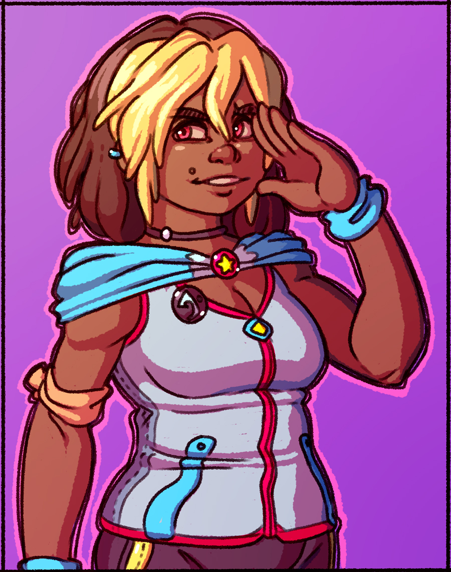
May was a pretty good month! I managed to complete my new website layout (almost.) I'm still missing some art work that I want to do for the empty right side, but overall I'm happy have a new design rolling that replaces the one I made in 2011. It doesn't really feel like it was that long ago, but I guess time flies when you get older. Whoops.
I'm still spending a fair chunk of my time working on a project with a few really cool people. Hopefully very soon I'll be able to share what it is and maybe even talk about it a little bit on my blog or in other places.
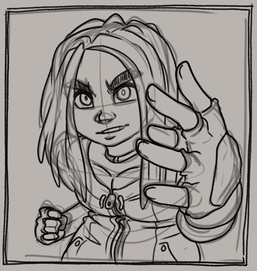
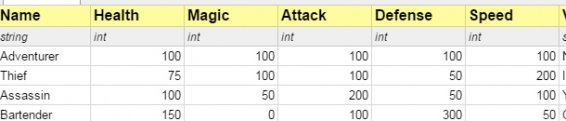
That being said I haven't really had a lot of time for personal projects. I'm still trying to spend as much time as I can drawing, and some of the free moments I have I spend working on my Pathfinder Character Sheet manager. I just recently added the ability to translate it to any language, and someone has already translated it to German. More on that later!
Sorry that it has been eerily quiet around here. Working on a secret thing is kind of new to me and I'm totally not used to not being able to openly share what I'm working on. I haven't streamed in over 6 months because I'm just not sure what I would stream. I am starting to feel a little bit of that itch though to get back to coding something games related. Maybe Otter FNA can be revived soon... but I got stuck in a lot of different problems trying to put it together. Starting to realize that I'm probably not smart enough to be making my own engine/api and I should probably start putting time into learning something else. But I love C# way too much, and there are no other solutions out there for 2d games and C#. Technically yes Unity does 2d and uses C# but Unity just feels like over kill and is painfully slow for me to develop in. Augh!
Anyway that's all I'll say for now. I feel like I could expand on a couple of these thoughts later as full posts, but some of these things I've already talked about at length many, many times.
Oh I'm still pretty anxious and stuff but at least I'm having fun on this small team project which I can't wait to show off at some point. Yeah!
I'm still spending a fair chunk of my time working on a project with a few really cool people. Hopefully very soon I'll be able to share what it is and maybe even talk about it a little bit on my blog or in other places.
That being said I haven't really had a lot of time for personal projects. I'm still trying to spend as much time as I can drawing, and some of the free moments I have I spend working on my Pathfinder Character Sheet manager. I just recently added the ability to translate it to any language, and someone has already translated it to German. More on that later!
Sorry that it has been eerily quiet around here. Working on a secret thing is kind of new to me and I'm totally not used to not being able to openly share what I'm working on. I haven't streamed in over 6 months because I'm just not sure what I would stream. I am starting to feel a little bit of that itch though to get back to coding something games related. Maybe Otter FNA can be revived soon... but I got stuck in a lot of different problems trying to put it together. Starting to realize that I'm probably not smart enough to be making my own engine/api and I should probably start putting time into learning something else. But I love C# way too much, and there are no other solutions out there for 2d games and C#. Technically yes Unity does 2d and uses C# but Unity just feels like over kill and is painfully slow for me to develop in. Augh!
Anyway that's all I'll say for now. I feel like I could expand on a couple of these thoughts later as full posts, but some of these things I've already talked about at length many, many times.
Oh I'm still pretty anxious and stuff but at least I'm having fun on this small team project which I can't wait to show off at some point. Yeah!
2 Comments